Project Phoenix
This insurance based product had been a juggernaut in its day. However age was catching up and a modern approach was badly needed to return this product back to its rightful place on top of the market.

Challenge
A longtime leader in the insurance industry had lost over 15% market share from their major online product. The product was well respected but nearing the end of its life-cycle. Browser support was becoming a major challenge as most features would not be support past IE7. In addition new users were down as they preferred adopting more modern, user centric solutions.
Research
This was a large product with a massive amount of variations depending on user input and data selections. The immediate challenge would be to understand the workflows. At the same time focus groups were underway. These groups were comprised of internal product users and end users.
Focus Groups
During the focus groups a large number of concerns and wants were identified. These were tallied and compared to the overall scope of the project. Of the five main drivers four were determined to be within budget and served as our guiding principles moving forward.
Contextual Inquiry
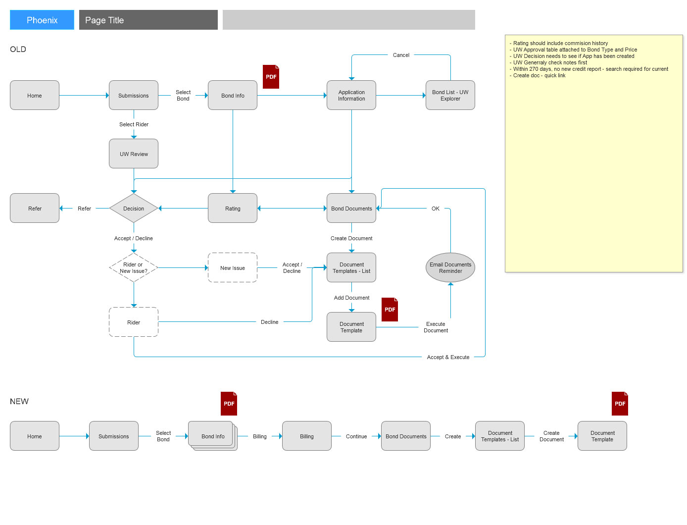
The first step to generating the user flows was contextual inquiry we worked with many of the underwriters on the product team to go through the system and document the day to day tasks.

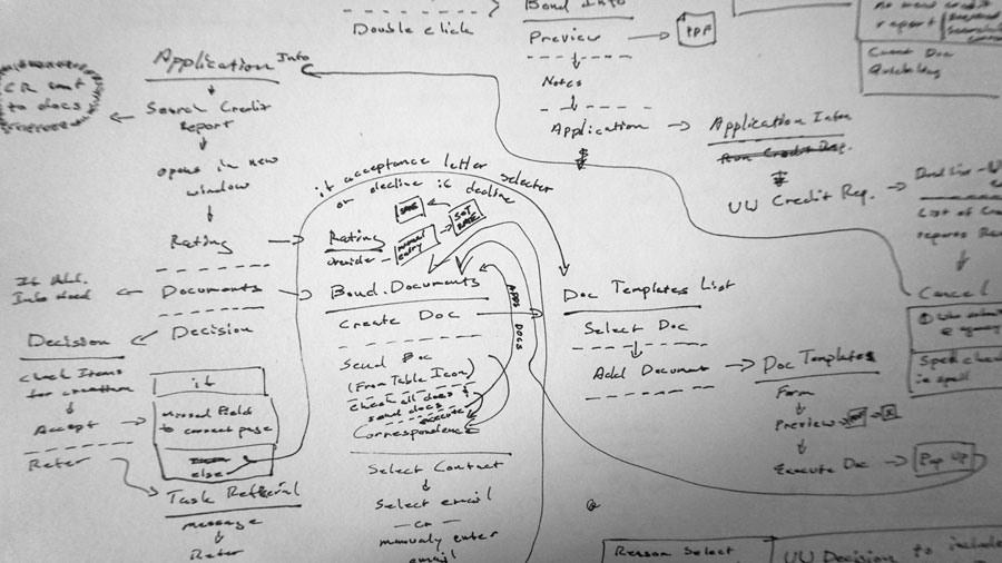
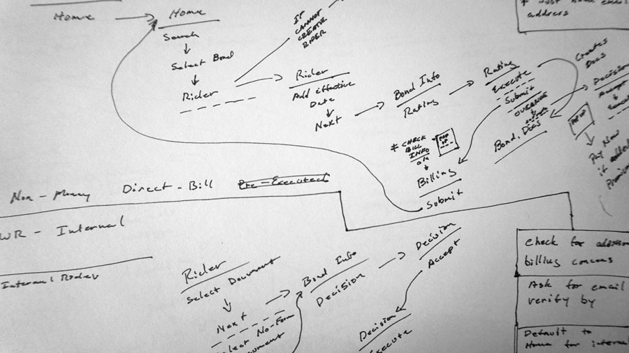
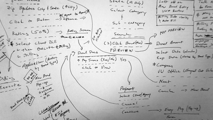
User Flows
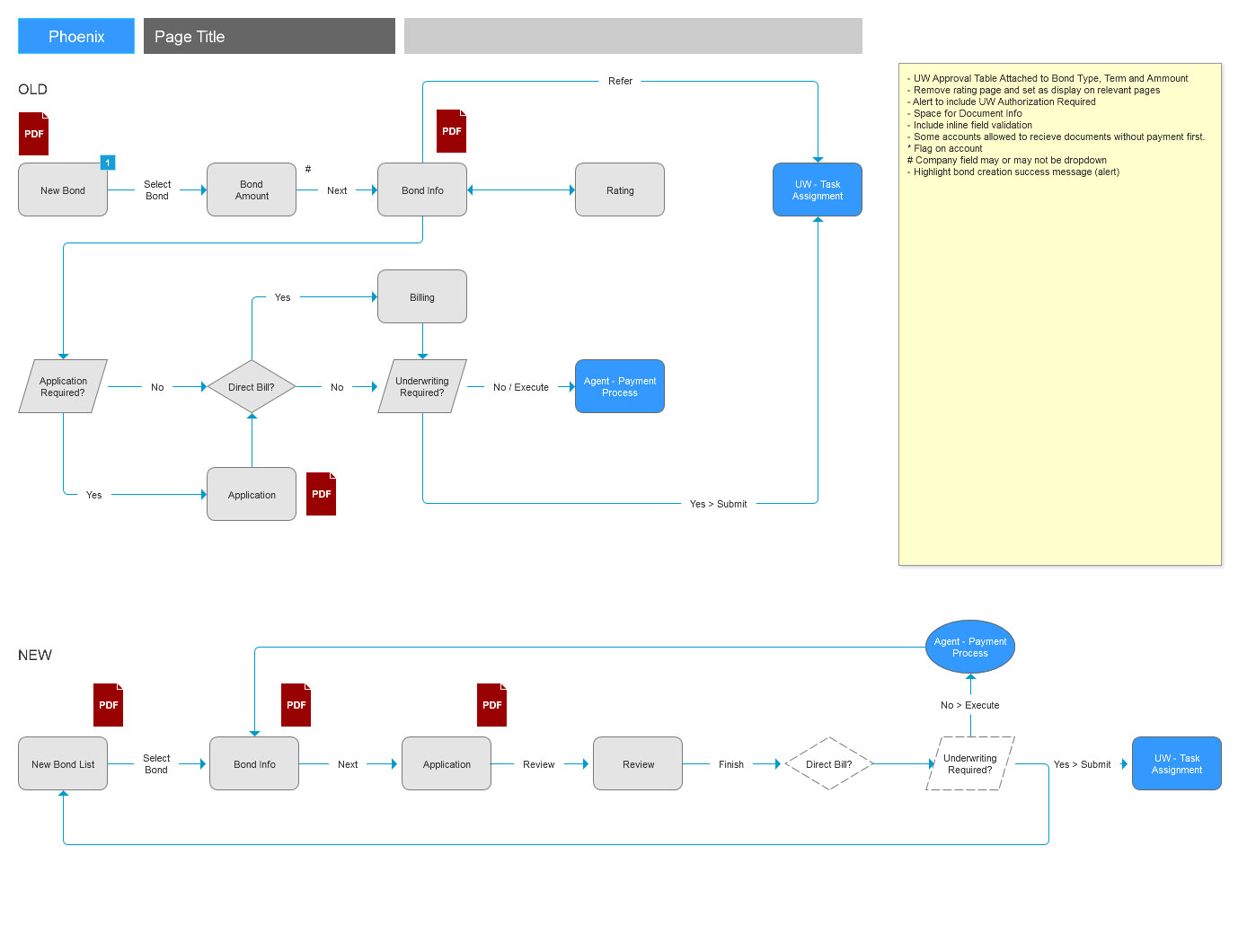
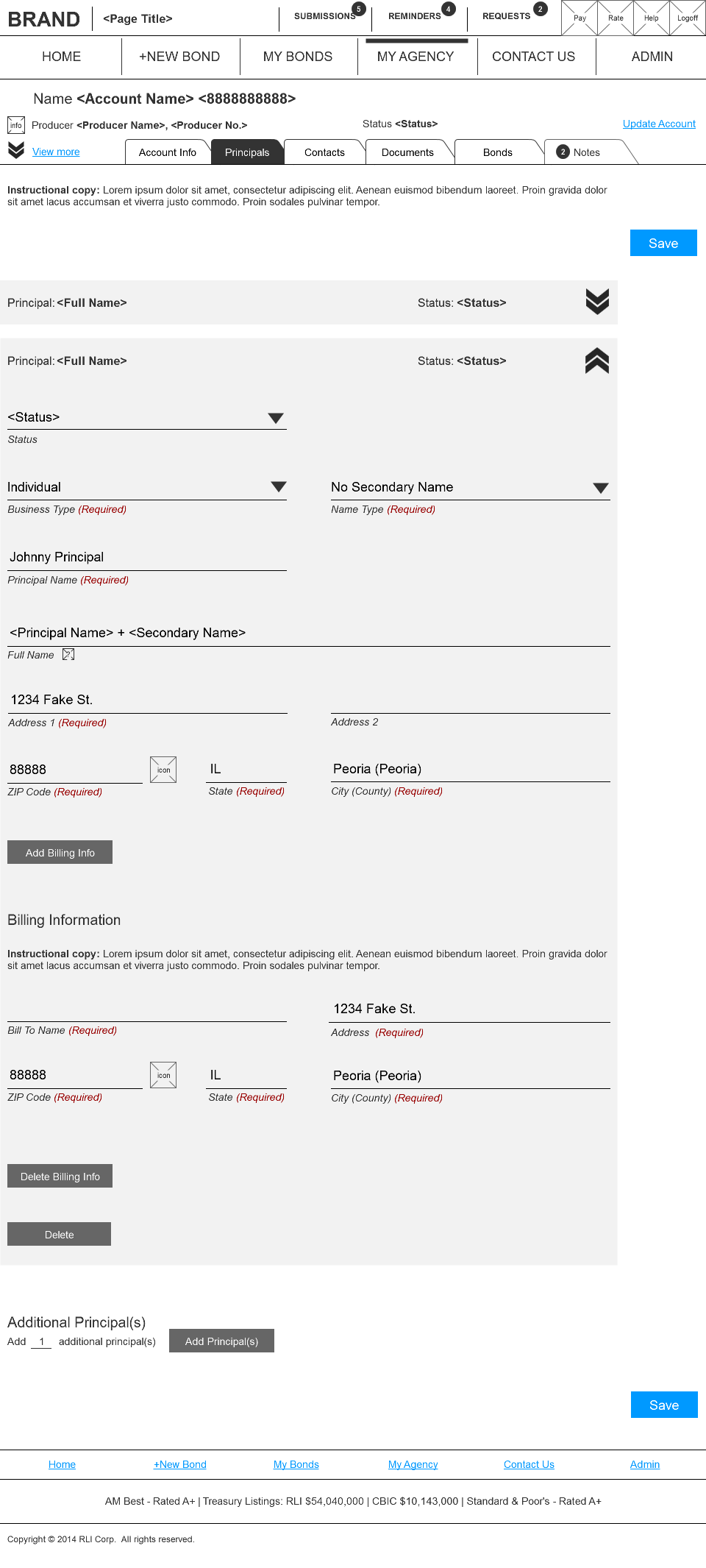
The documentation from the contextual inquiry was translated into electronic documentation and presented for review. We worked with the team of underwriters to ensure each flow was accurate. Once complete the main workflows were identified and set as a priority and reworked. By working through each flow we realized that all could be accommodated by the same workflow, reducing the screens for development by 50%.

Strategy
The workflows provided some keen insight. This sight had been modified multiple times over its 10+ years and never had any standards been put into place. There we literally over a 100 different design patterns in use and no two interactions were the same. Moving forward a pattern library would be created and each interaction optimized to minimize, not only development, but the number of patterns users would have to learn.
Architecture
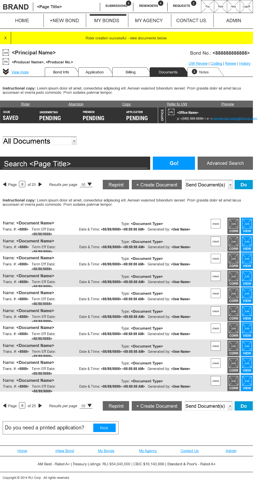
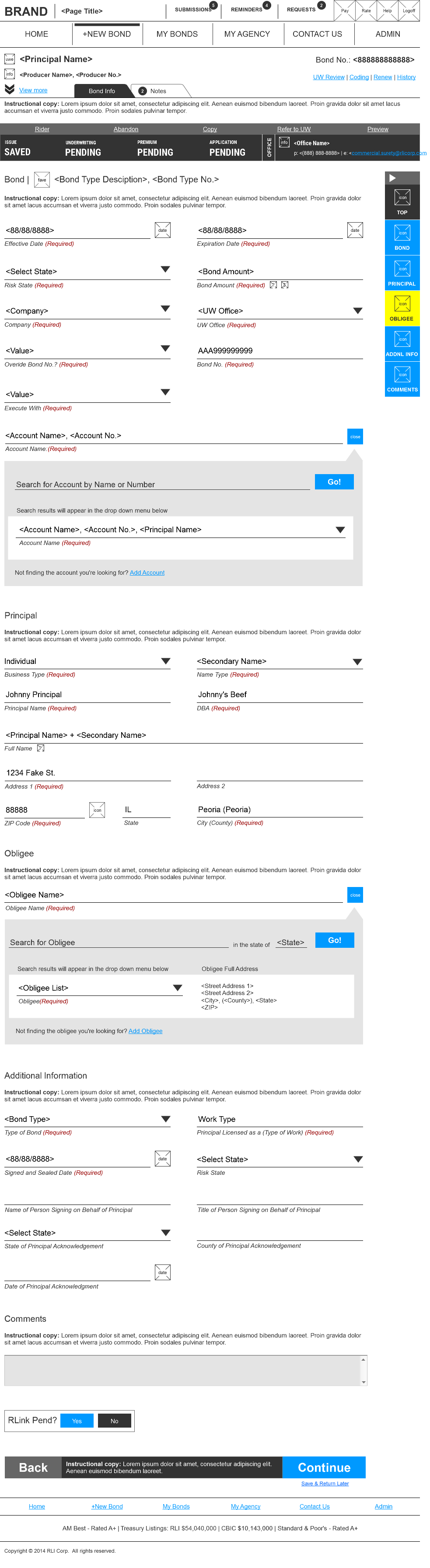
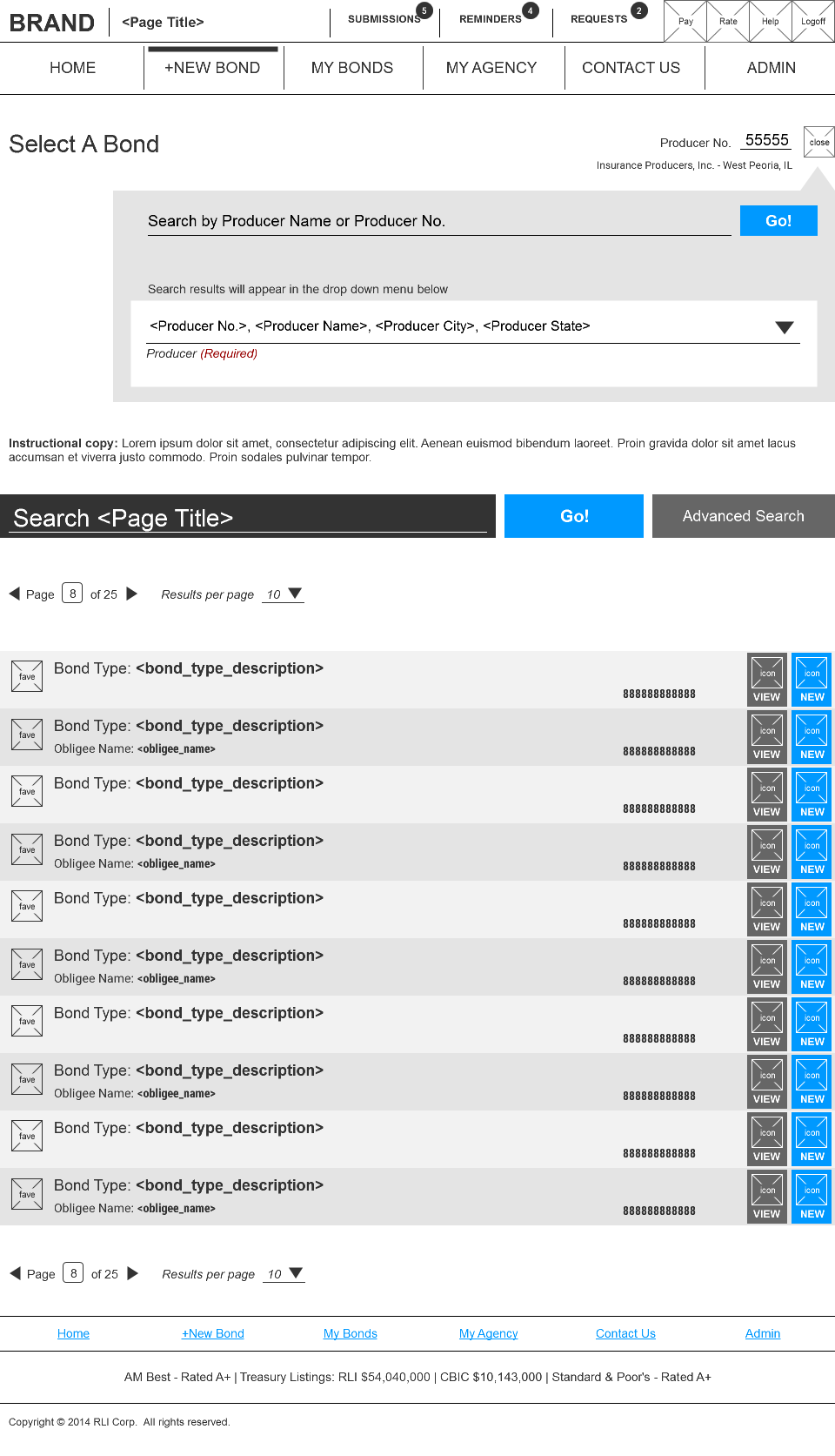
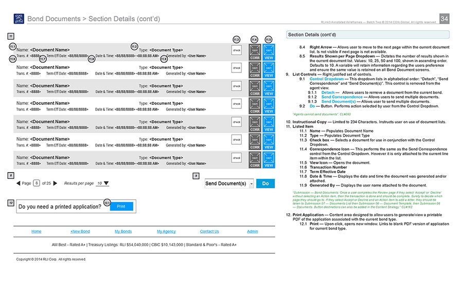
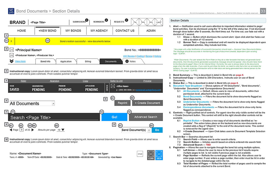
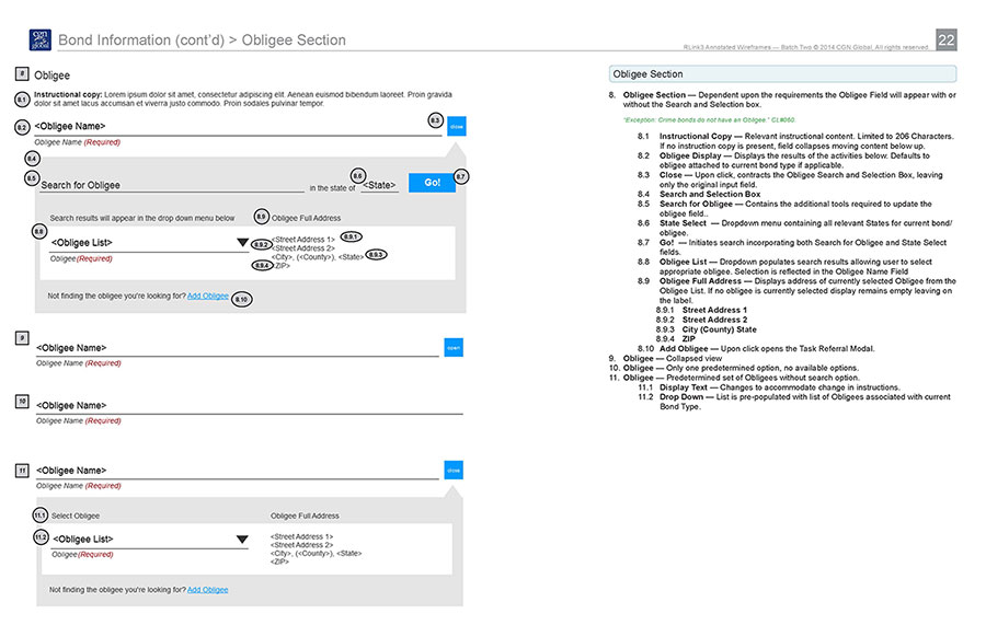
This was no small task as the product team had requested a storyboard approach. This meant a step by step display of each process with all its screen variations. It would increase the time to create the wires, but it did also increase the project’s overall accuracy.
Developers Guidelines
Developing a minimized pattern library had another financial benefit. Key screens were still identified for design approvals, but to design the entire site we only had to look at the pattern library and design the remaining common elements. This reduced the design cost substantially and the developers were enabled to create new elements without the need of additional design work. Each interaction was carefully detailed out and documented into what we had titled, The Developers Guidelines.
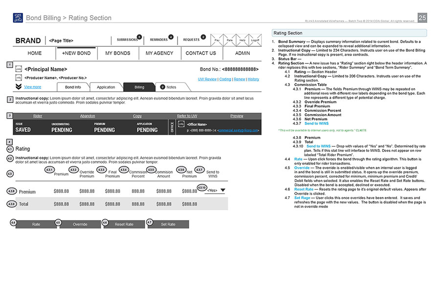
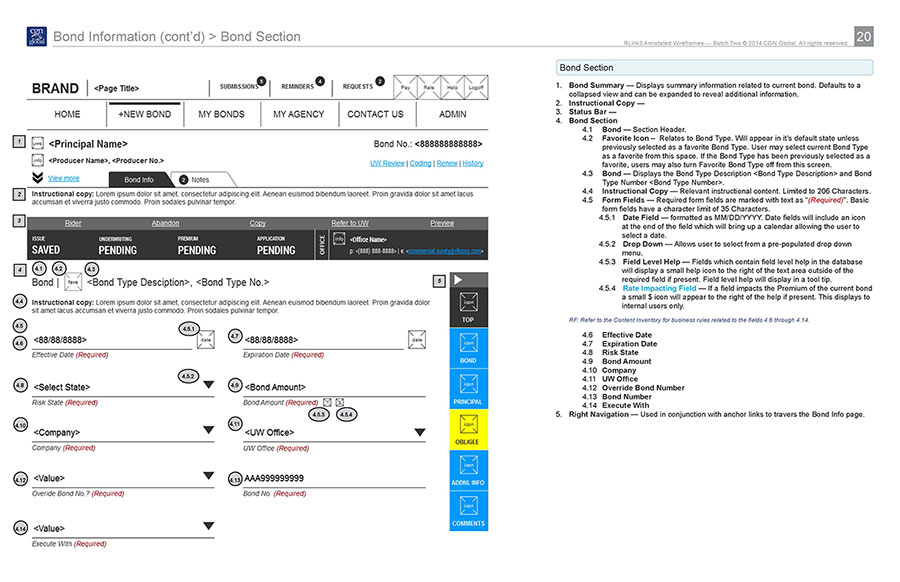
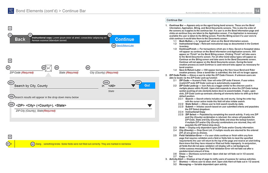
Annotations
The entire site was annotated and each screen was careful detailed to ensure accuracy in development. The effort was broken up into three phases to allow for feedback at the completion of each phase and minimize overall project delivery time. Global elements were annotated first, then common section elements and finally unique screen elements. This approach ensured that any revisions only had to be made once and again minimized the overall project delivery time.
User Testing
We tested this project twice based upon the use cases generated in both the user-flows and focus groups. The first time we tested was upon completion of the initial wire-frames. The feedback generated guided our work through the remaining site. The second user test was performed upon completion of the wire-frames and before annotations. We used two groups each time, a control group was was familiar with the process and a test group who was new to the site. Each time the site passed with flying colors.
Results
A minimum viable product (MVP) was produced to test the potential of the newly created product, dubbed the “framework”. The outcome was so successful related businesses requested personalized product portals that would immediately increase revenue, which put the product on track to quickly regain the lost market-share while the remainder of the product is built to fruition.