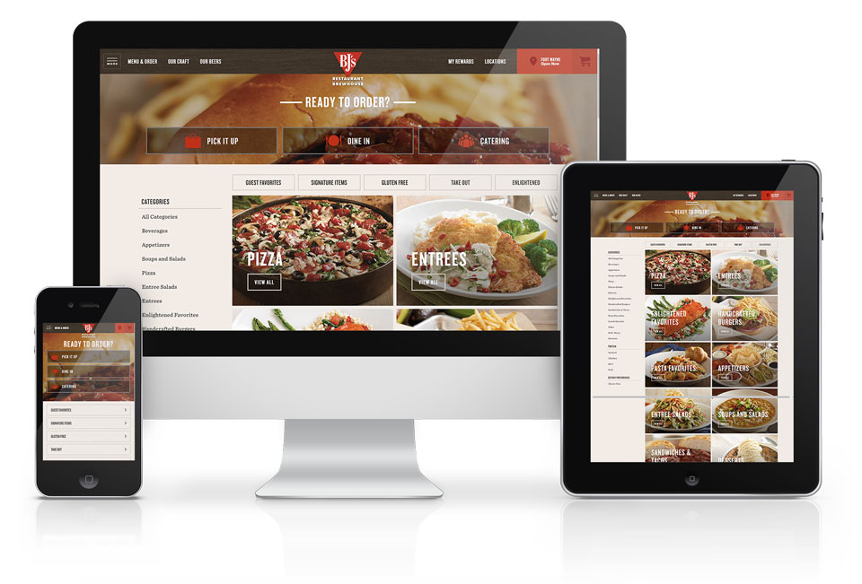
BJ's Brewhouse
BJ’s Restaurant & Brewhouse wanted to break away from the pack and produce a unique, best in class online ordering experience.
Challenge
Growing west-cost restaurant chain BJ’s Restaurant & Brewhouse had out grown its pre-packaged solution and needed a responsive, custom platform to increase their conversions from both online orders and loyalty program sign-ups. While the platform had to be solid, it also had to be unique.
Research
To create something new we, first needed to understand the old. An in depth research project began and the first step was a competitive analysis was performed on 10 restaurants with online ordering capabilities.
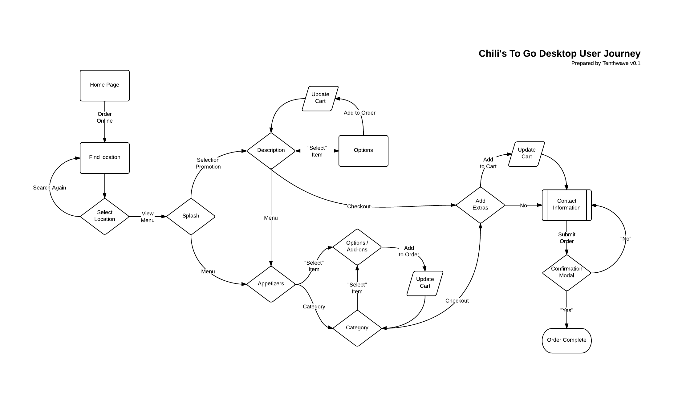
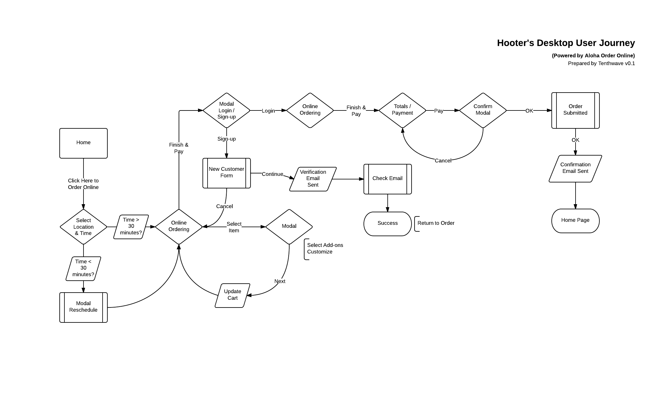
User Flows
From those ten the top three were selected and the work flows were mapped out. We used an interaction shorthand to map out the interactions. It was so successful we still use it to this day. Once all the sites were mapped out, we used Lucid Chart and mapped them out electronically for delivery and review.
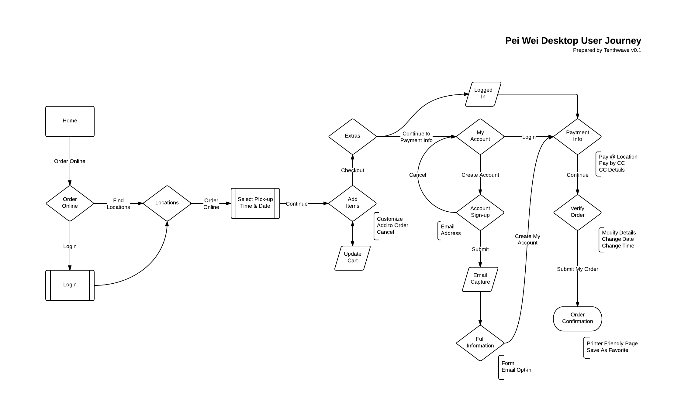
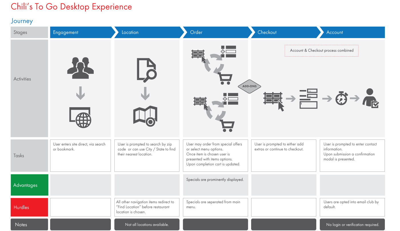
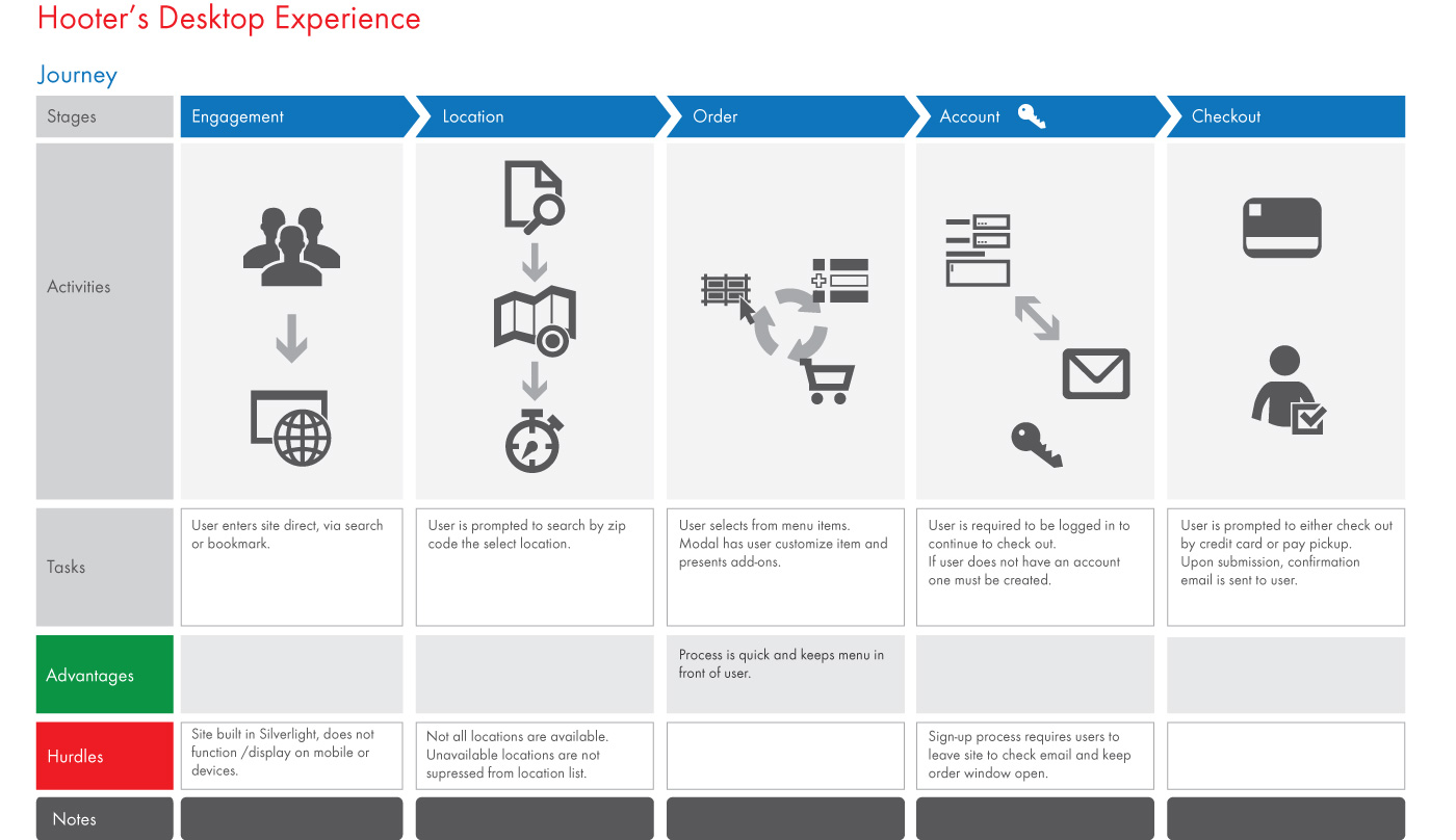
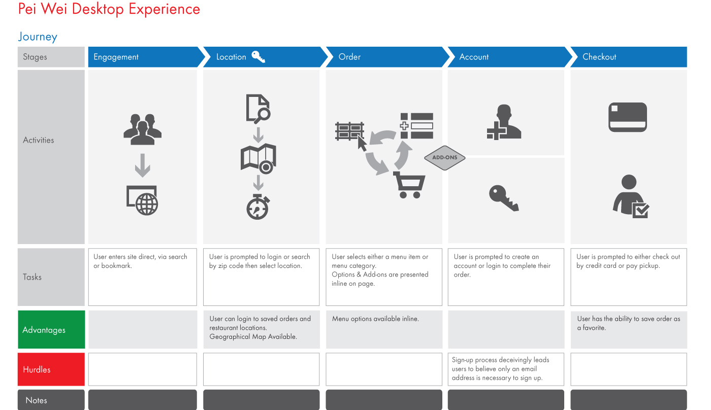
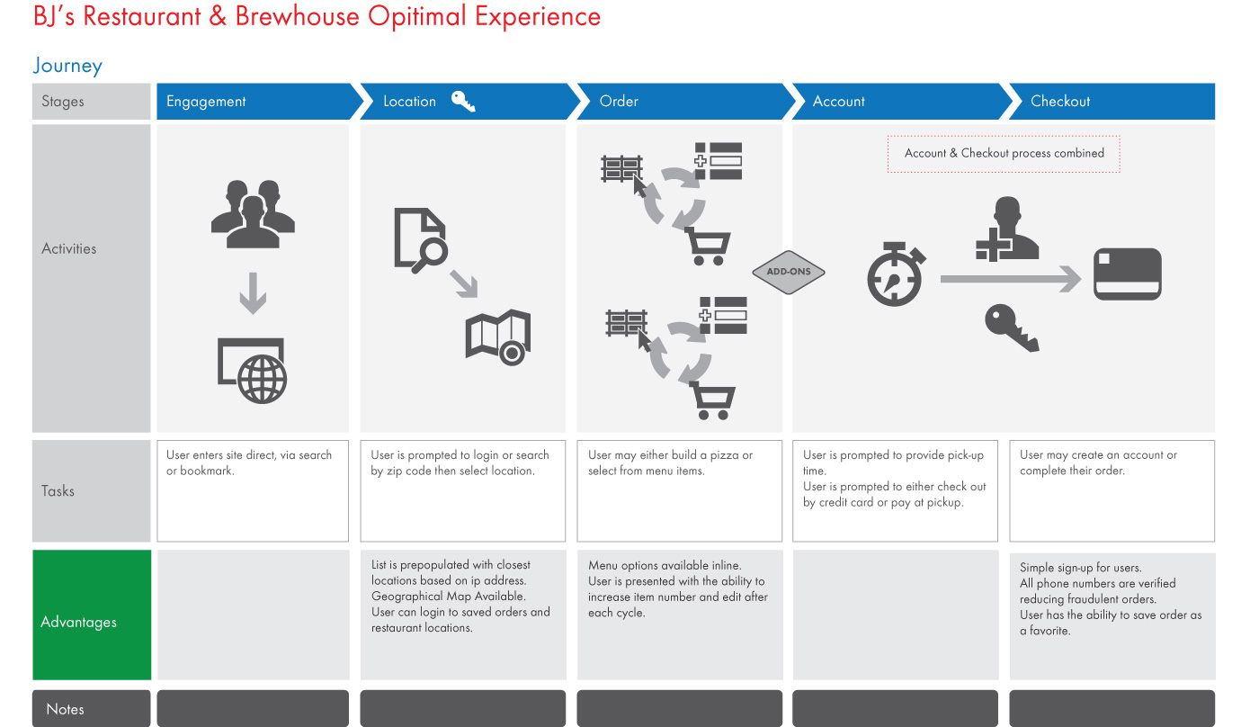
Journey Maps
To further illustrate our findings, journey maps were created. These journey maps illustrated the challenges and benefits of each system reviewed. We discussed each with the client and agreed upon the best options.
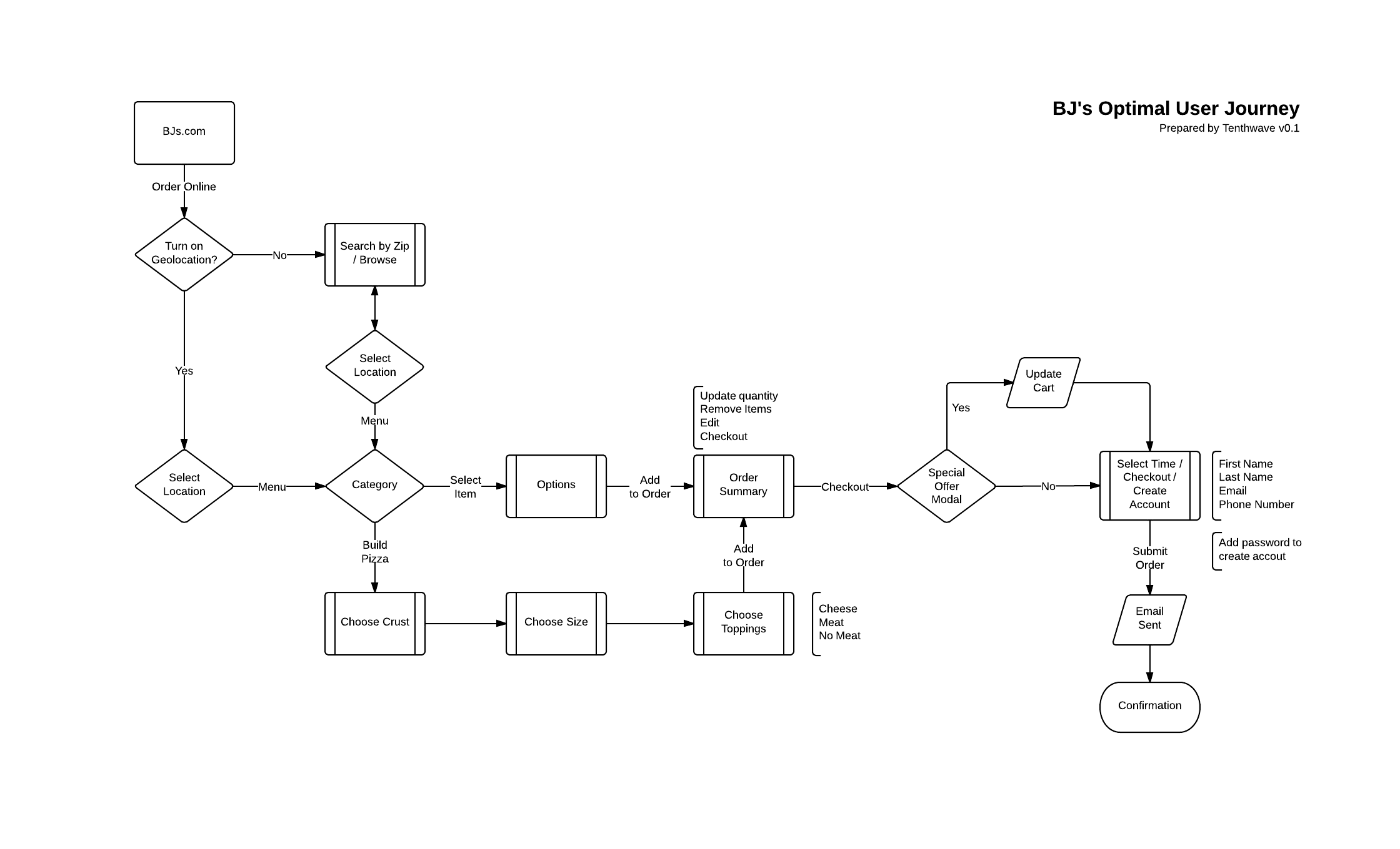
Refined Experience
Taking the findings from the user flows and journey maps we created what was called the optimal experience. Taking the best parts of each and combining them while removing the challenges. Or as Bing Crosby would say, “accentuate the positive, eliminate the negative”.
Contextual Inquiry
The online ordering experience still required some details to fill in the gaps. The best resource was those who performed the task on a daily basis and had great experience interacting with the customers. We discussed the order taking process in detailed conversations with the restaurants servers. The finding allowed for a compete account of the experience both online and off.
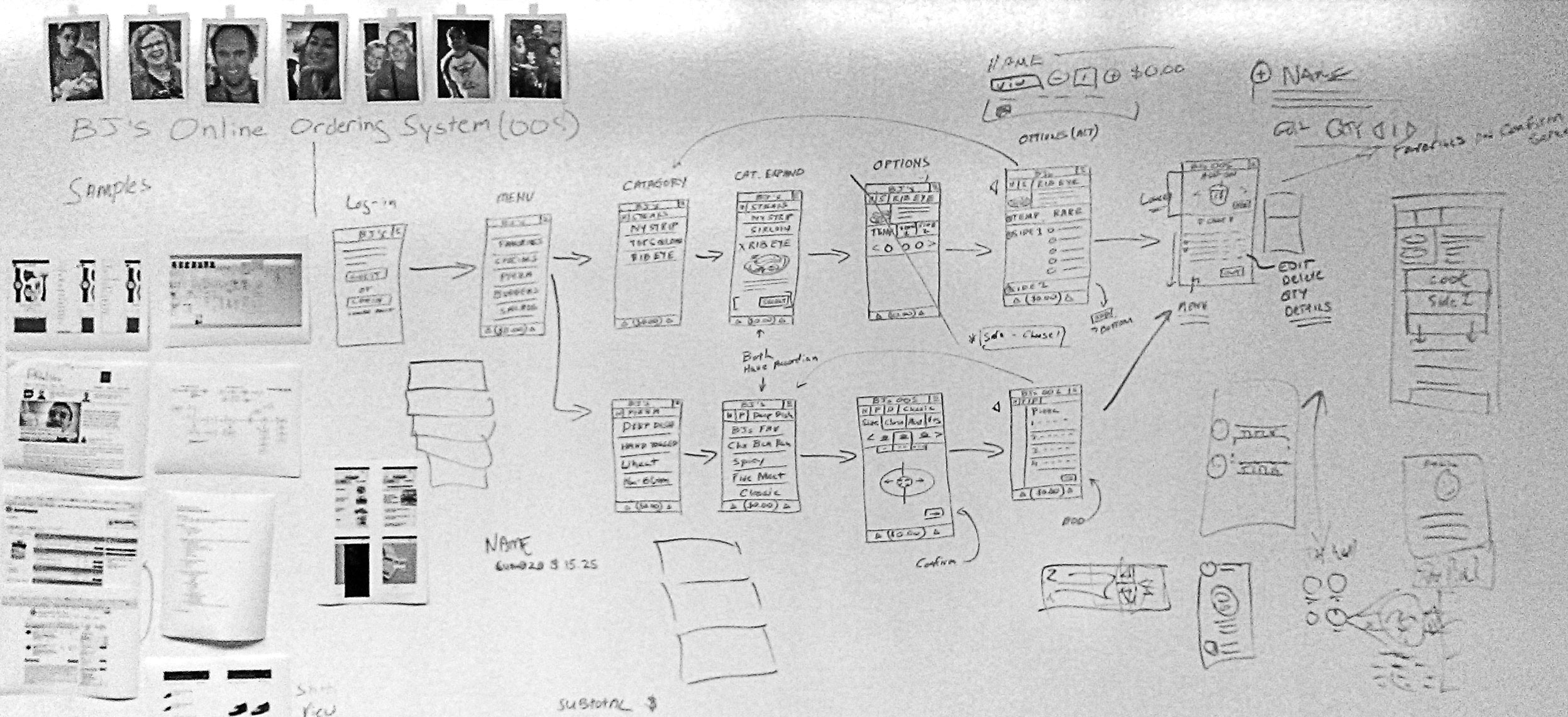
Architecture
As we began working on our mobile first design we created what we called makeshift personas and attached them to the white board. These were images found on the internet that fit the marketing demographics. While we began to whiteboard the experience it allowed us to ask, “how would this person react to this interaction?”
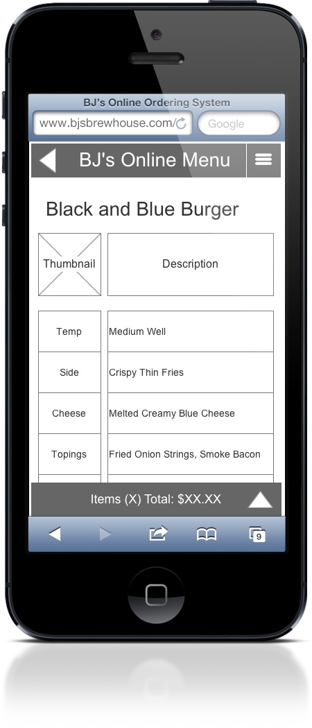
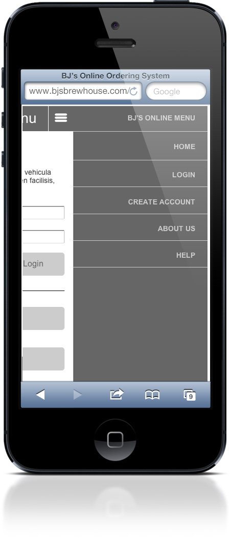
Wire-frames
After several rounds of white-boarding we finally felt ready to move into Axure. We continued the mobile first experience and took it a step further to create a fully function prototype. The prototype passed variables to emulate both the guest and logged-in experience.
Results
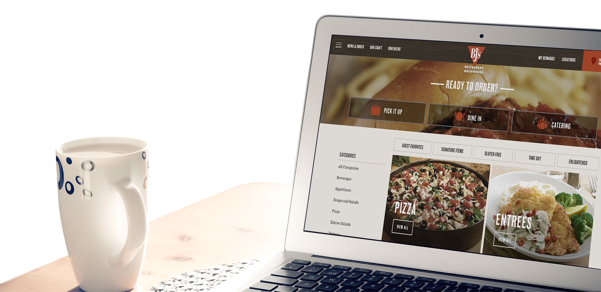
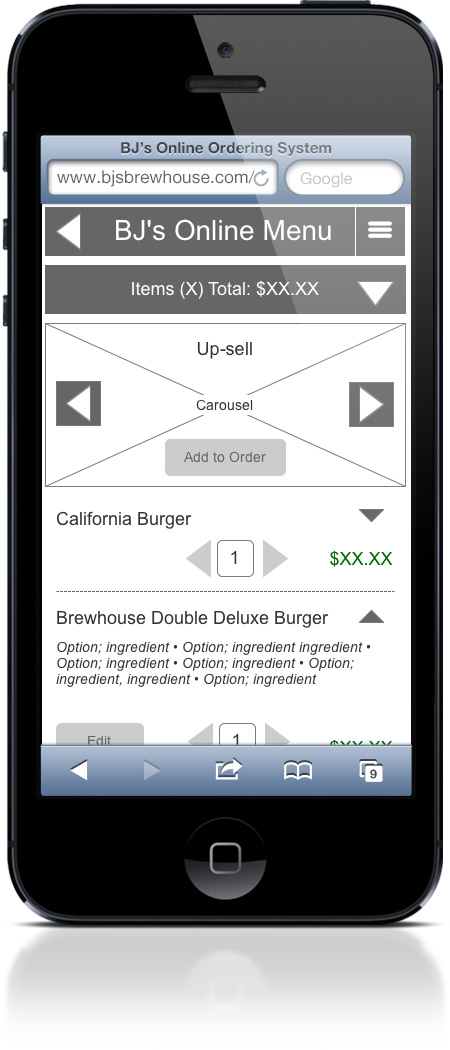
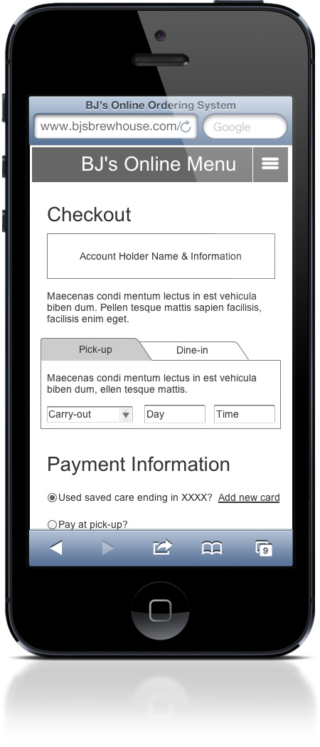
The effort resulted in an intuitive, fully responsive web application with a reconfigured menu flow that simplified ordering, and improved the checkout process.
The new application was rolled out to 12 pilot restaurants so we could test, learn, and improve the application before rolling it out to all their locations. The solution made an immediate impact and significantly increased conversions and loyalty program sign-ups. The program is now available for all locations and continues to be successful.