U.S. Bank
The U.S. Bank Corporate Payment Solutions (CPS) had a question, “how do we increase user engagement?” They continually added relevant, user centered content, however users rarely viewed more than one page.

Challenge
U.S. Bank CPS had undergone a redesign every year for nearly five years. Their goal was to increase consumer engagement and in the process, increase conversion. However, each redesign did not provide the desired results. Instead the analytics remained the same. The client had tasked us with doubling the pages per click and increasing traffic.
Research
Before we identified the solution, we first needed to clarify the challenge. Research began with a series of interviews of both the client and end users. Simultaneously a thorough review of the site’s analytics and content was performed.
The research and interviews provided two key problems. The site’s keyword density was very shallow. The same term was almost never used twice to describe like content. The other is a common challenge among corporate sites, a lack of access to relevant content, leaving users to wonder where to go next.

Strategy
With an increase in traffic and engagement the primary concerns, the strategy needed to address two quantifiable measures. The bounce rate was entirely too high and the pages per click were entirely too low. In order to address both concerns a comprehensive approach needed to focus on information architecture and content strategy.
Information Architecture
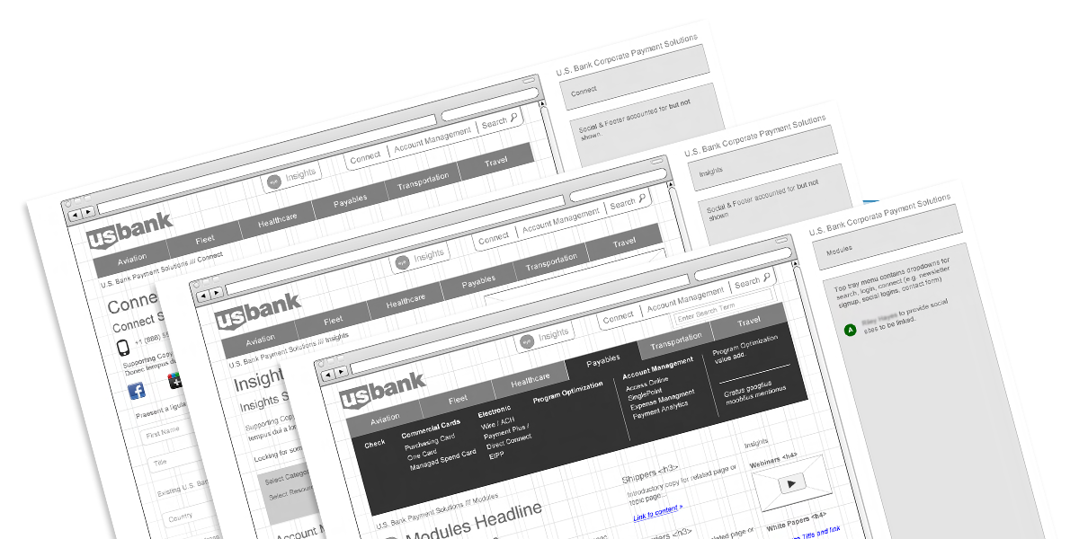
A large number of design patterns were reviewed. The focus being on how to keep users engaged and continually present them with relevant content. Given the large content library three columns were used to bring in relevant content not only by category but by tag as well.
Content Strategy
A detailed content review and keyword analysis was performed to create a taxonomy that would allow U.S. Bank to use competitive keywords. The taxonomy was then used to rewrite each article and introduce images and subheads to meet the users expectations to scan and article.

Results
User testing was positive across the board and all scenarios passed with flying colors. The long awaited lunch date was very exciting indeed. After the first month we had over six pages per visit and a bounce rate of under 20%. Now we had to wait to and monitor the analytics to show quantifiable results.
The analytics were monitored for the next six months. Initially the site visitors went down, but the bounce rate remained low. The pages per visit returned to earth after the post launch excitement, but after three months leveled at 2.4. Also at the three month mark was a notable improvement in organic search providing the increased acquisition numbers we were hoping for.
At six months the numbers were still holding steady. We had successfully fulfilled our obligation to the client, and proven the value of experience design.

